Technical Analysis (TA)
Master crypto technical analysis! Learn tools like RSI, trendlines, moving averages, chart patterns, and Fibonacci retracements to trade smarter.
Posted by
Related reading
Maximize crypto profits with our hold vs. trade calculator! Compare strategies, consider tax impacts, and find your breakeven price. Quick and easy to use!
Plan your trades effectively! Discover key questions to manage risk, set strategies, assess scenarios, and balance position sizes for disciplined crypto trading.
Technical Analysis (TA) is a method traders use to evaluate and predict the future price movements of an asset by studying historical market data. In the volatile world of cryptocurrency, technical analysis helps traders make informed decisions based on trends and patterns in market behavior. TA helps you go from just guessing to making decisions with higher odds. However, nothing is guaranteed. Here are the key tools and concepts to understand when diving into technical analysis.
Tools for Technical Analysis
Each artist needs a canvas, paint, and brushes. Here are some tools to check out.
- TradingView: Offers a free account with ads. I personally use TradingView and don't have any major complaints. Alarms work on both desktop and mobile. You can also code your own indicators and test them using the backtesting tool. If you have a free account but want to see multiple charts on one page you can check out cryptowatch.net.
Candlestick Charts
- What they are: Candlesticks represent price movement over a specific time period. Each candlestick shows the opening, closing, high, and low prices for that period.
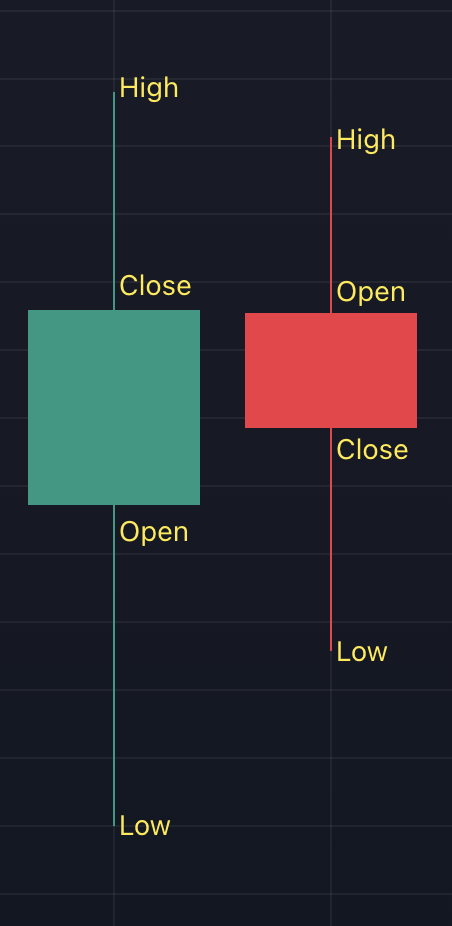
Candlesticks - The thick rectangle is called the body and the thin lines above and below the body are called shadow or wick.
- Red means the closing price was lower than the opening price, while with a green candle, it's the other way around.
- Candlestick charts display much more information than line charts. For example, the line chart doesn't show that the price dipped below $50,000, whereas a candlestick chart reveals that detail.

Line Chart - Only shows closing prices 
Candlestick Chart - How to activate candlesticks in TradingView:
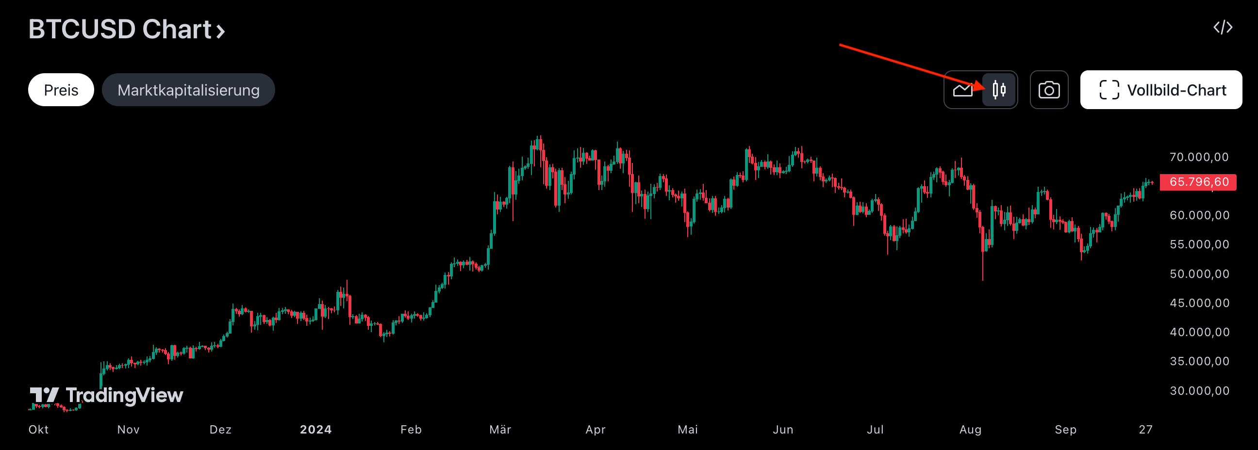
Activate Candlestick Chart in TradingView
Log Chart
- What it is: A logarithmic scale (or log scale) is a type of scale used in graphs where the values increase by orders of magnitude rather than by a constant amount. In simpler terms, instead of each step on the scale increasing by a fixed number (like in a linear scale), each step increases by a factor of a fixed number, such as 2. For example, 2, 4, 8, and 16 would be equally spaced on a log scale, even though the absolute difference between these numbers grows.
- Importance: Log charts are useful for viewing long-term trends, especially in assets like crypto, where price changes can be dramatic.
- Comparison Log Chart vs. Regular Chart:
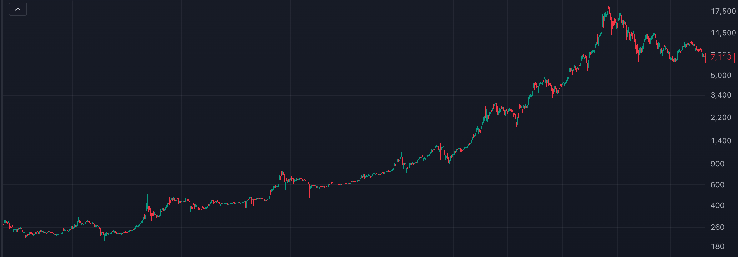
Log Chart 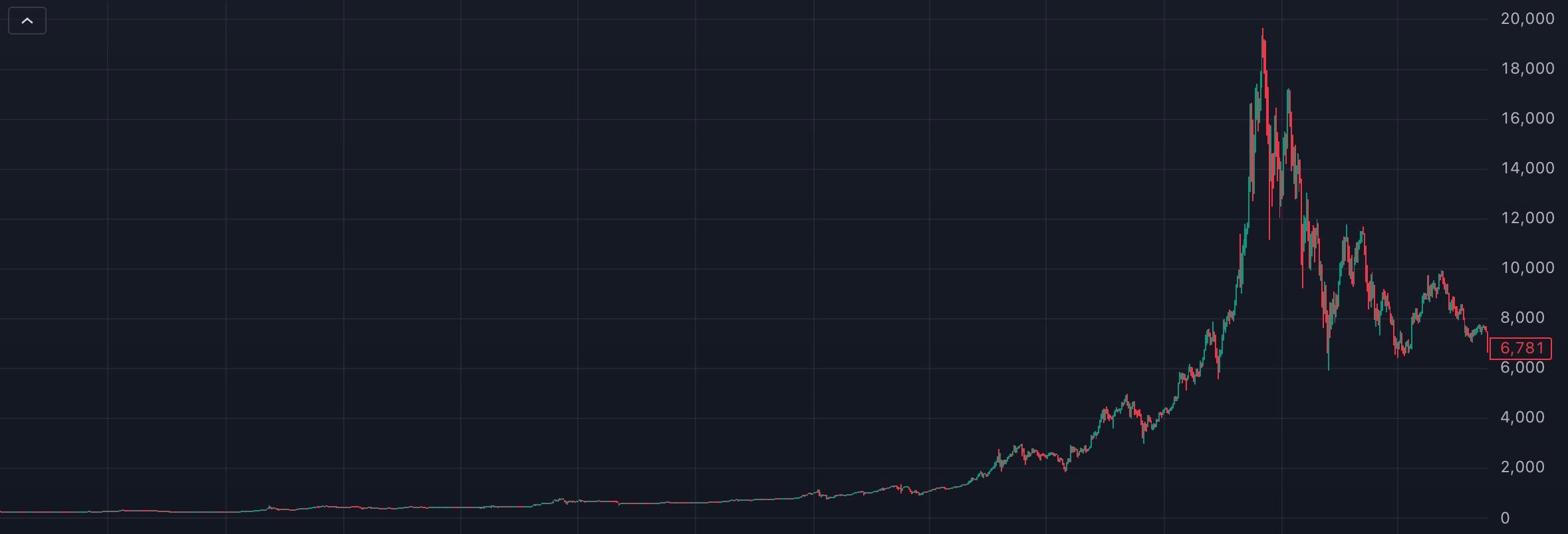
Regular Chart As you may notice, the first half of the regular chart looks almost flat with minimal price movement. However, if you switch to the log chart, you can see significant price swings during this period, with over 100% or more. When viewing a chart over a multi-year period with extreme price differences between the lowest and highest points, switching to a log chart can provide a clearer picture of the actual price movement.
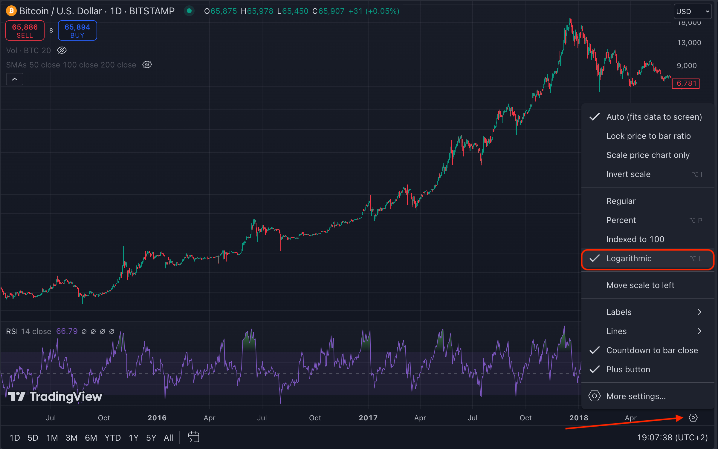
How to switch to a log chart in TradingView:
Time Frame
- What it is: The time frame refers to the period each candlestick or data point represents, like 1 hour, 1 day, and 1 week.
- Importance: Different time frames offer insights into short-term vs. long-term trends. Day traders often use short time frames, while investors may focus on longer ones.
- Day trading is not recommended though. It is really tough to be a profitable day trader.
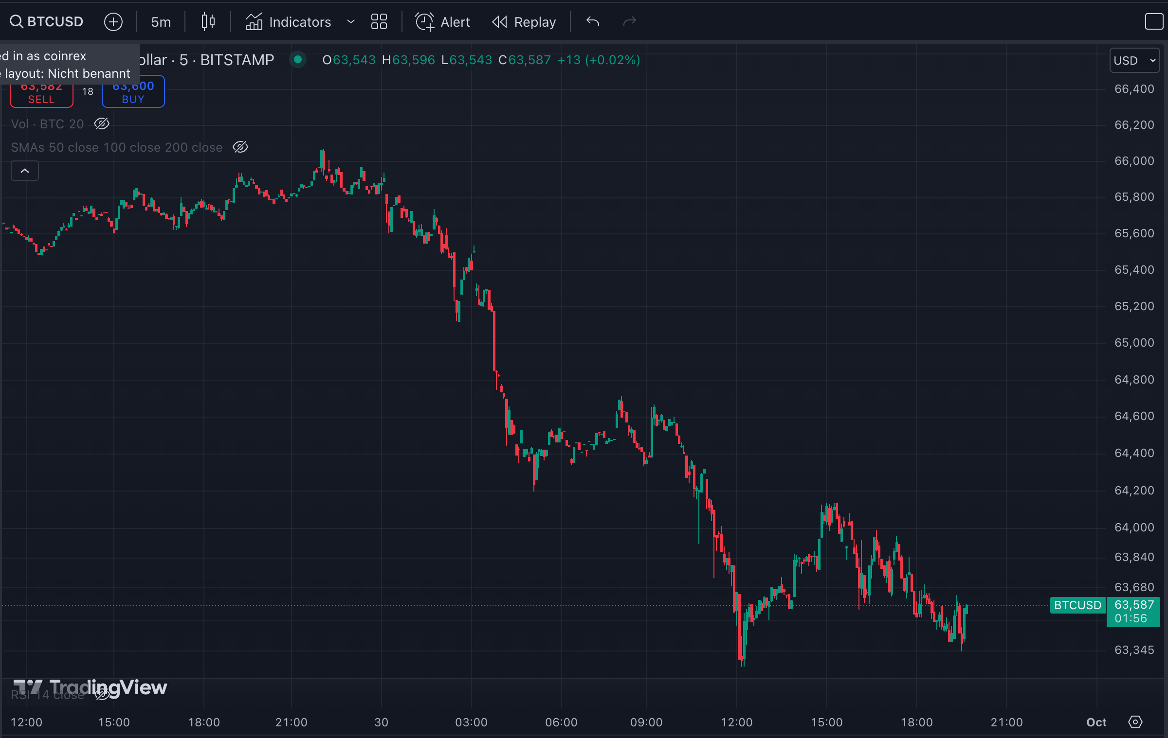
- Time frame comparison:
5 min candlesticks 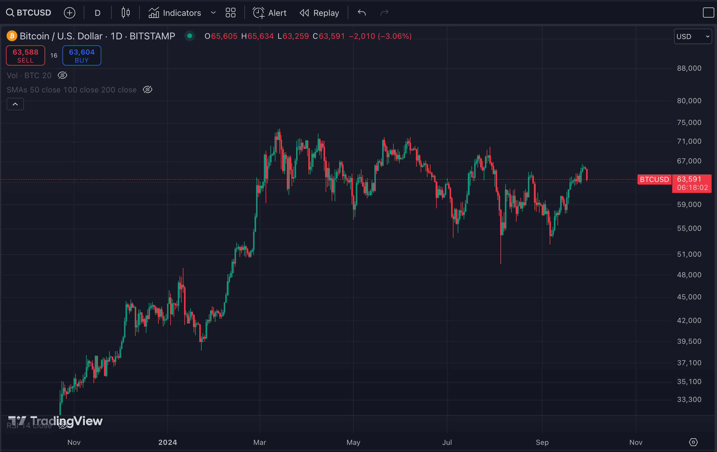
1 day candlesticks At first glance, the 5-minute chart looks alarming, with the price falling rapidly.
However, if you look at the 1-day chart, that same 5-minute chart is represented in just the last two candlesticks. So, always choose the right time frames for your analysis based on your purpose.
I personally use the 1-day timeframe the most. I also check the weekly and monthly charts. The hourly is not really interesting for me because I have a larger time horizon. There are some situations where I use timeframes below 1 day. When I'm planning to exit or enter a trade, I tend to zoom in to fine-tune my execution point.
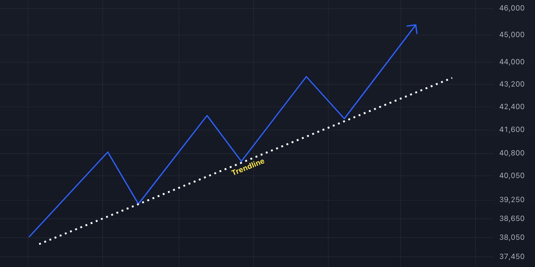
Uptrend
- An uptrend occurs when the price of an asset consistently makes higher highs and higher lows over time.
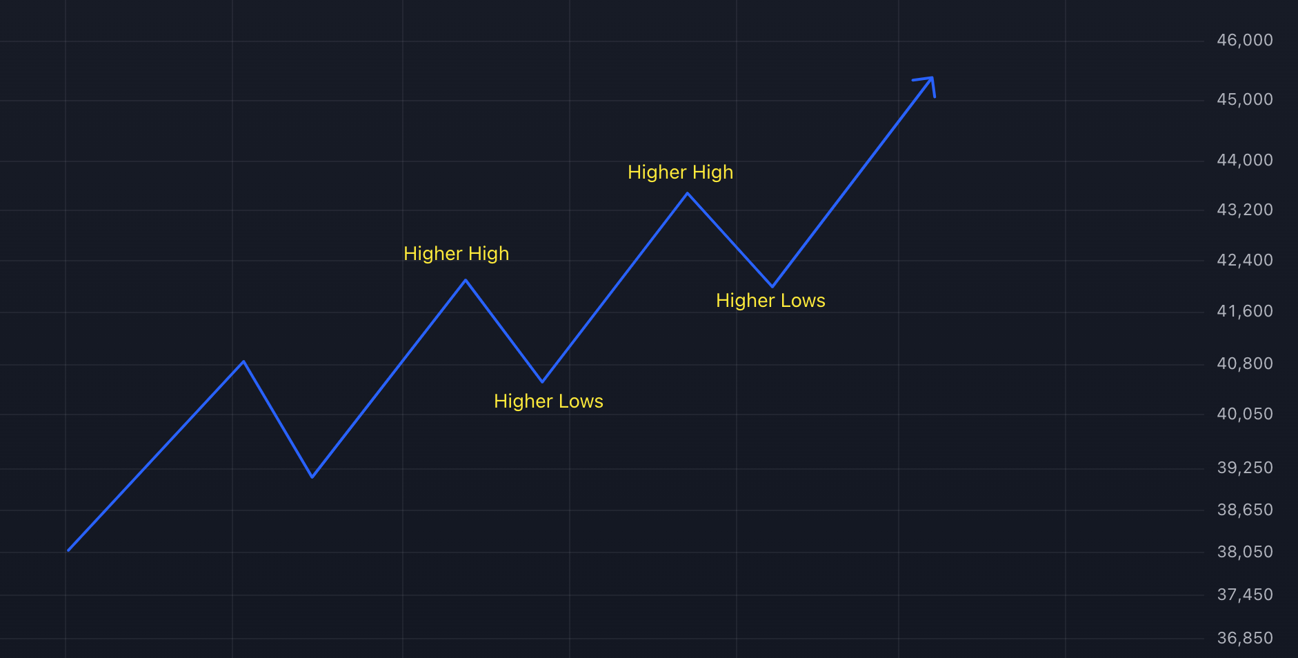
Uptrend - Theory 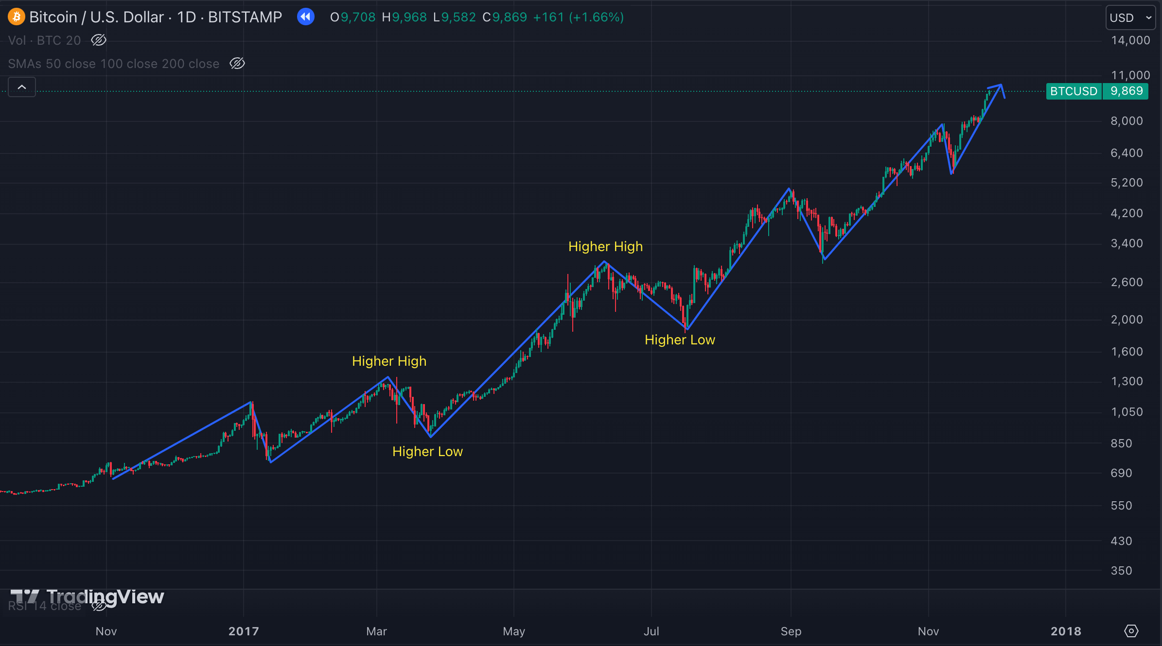
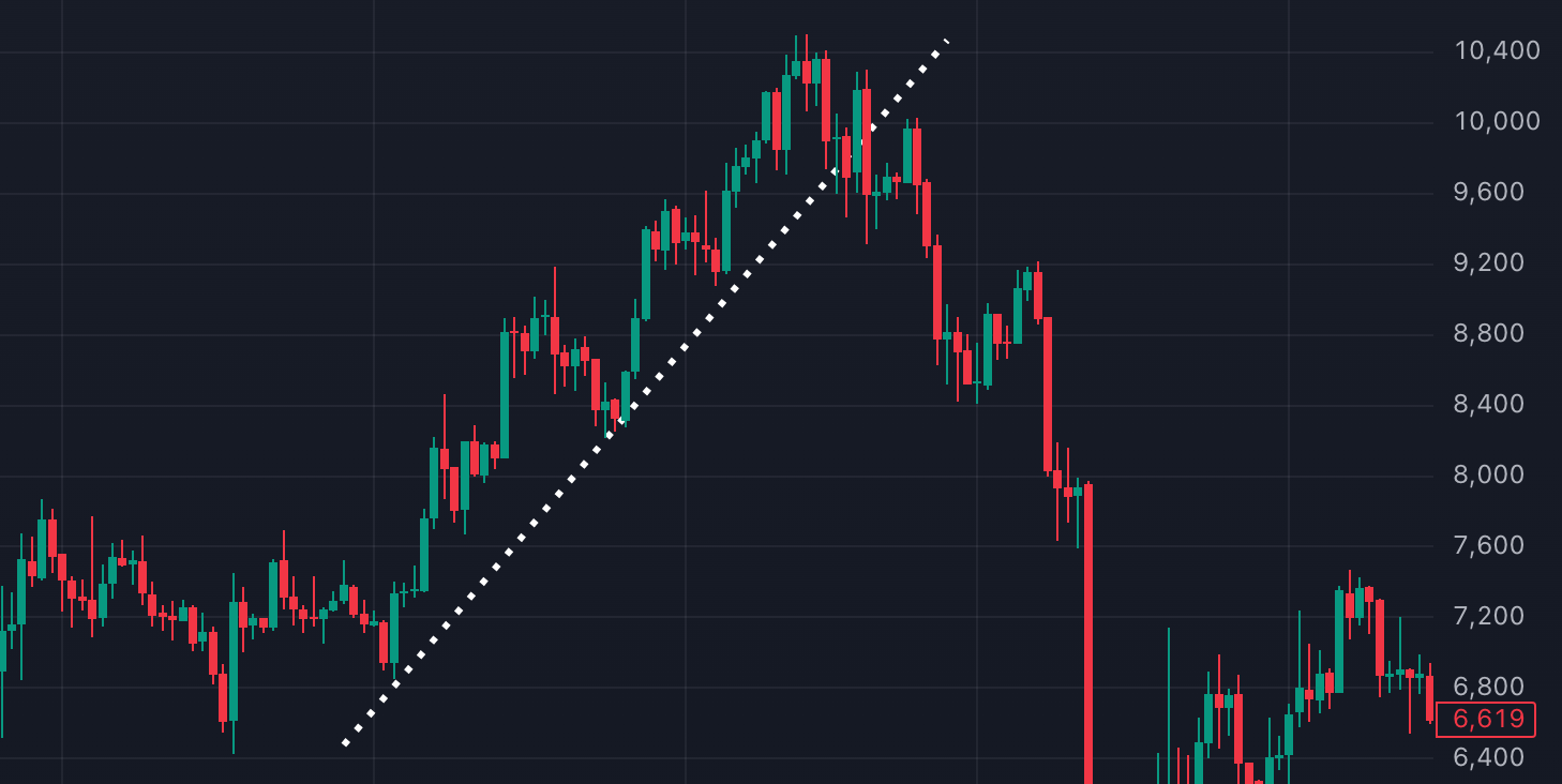
Uptrend Example
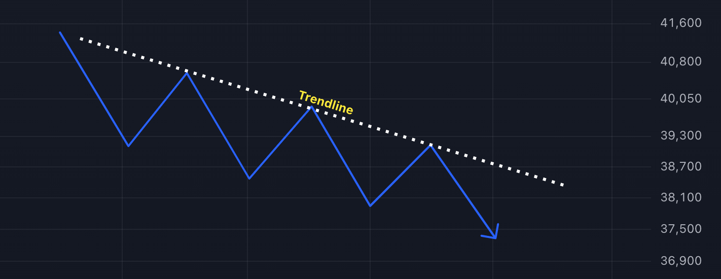
Downtrend
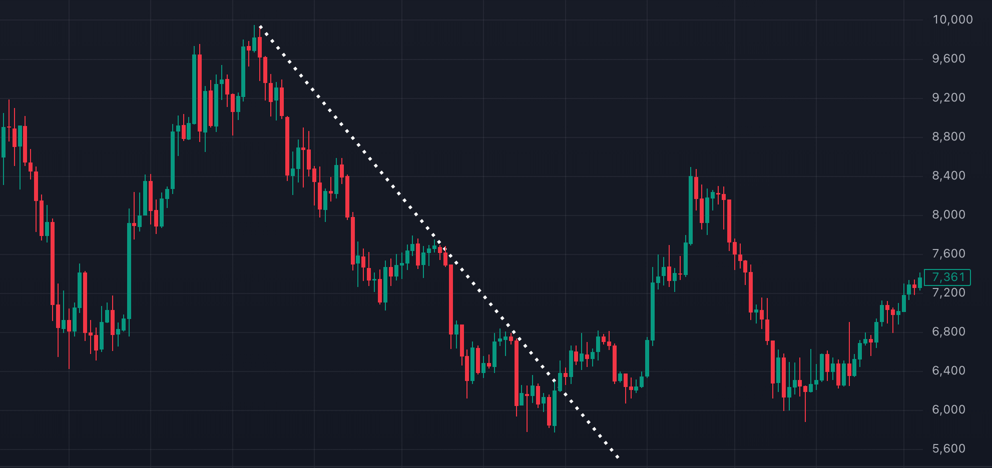
- A downtrend is characterized by lower highs and lower lows.
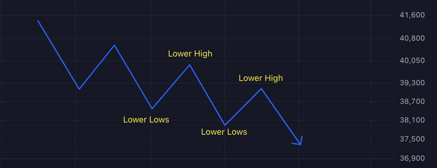
Downtrend - Theory 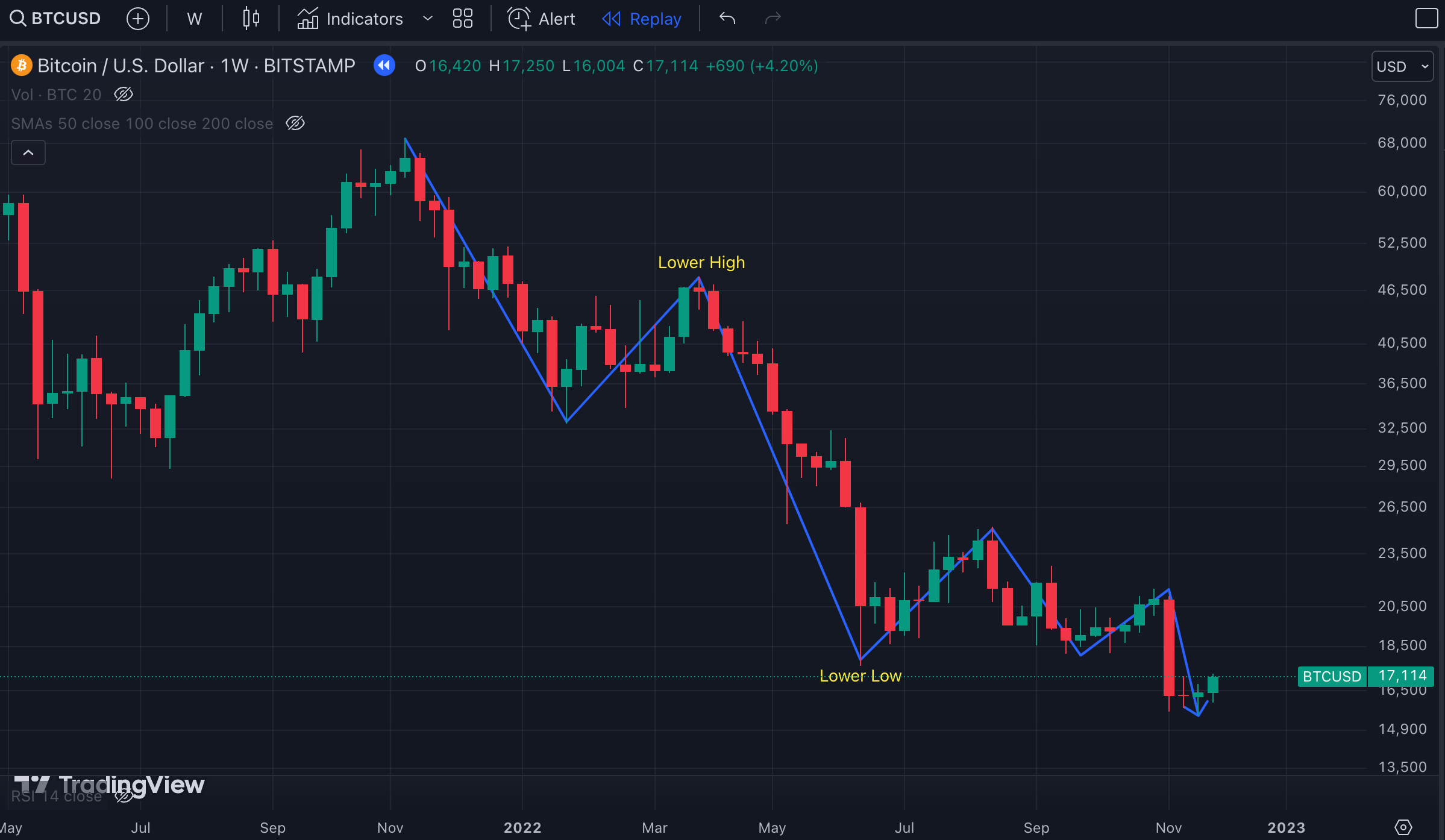
Downtrend Example
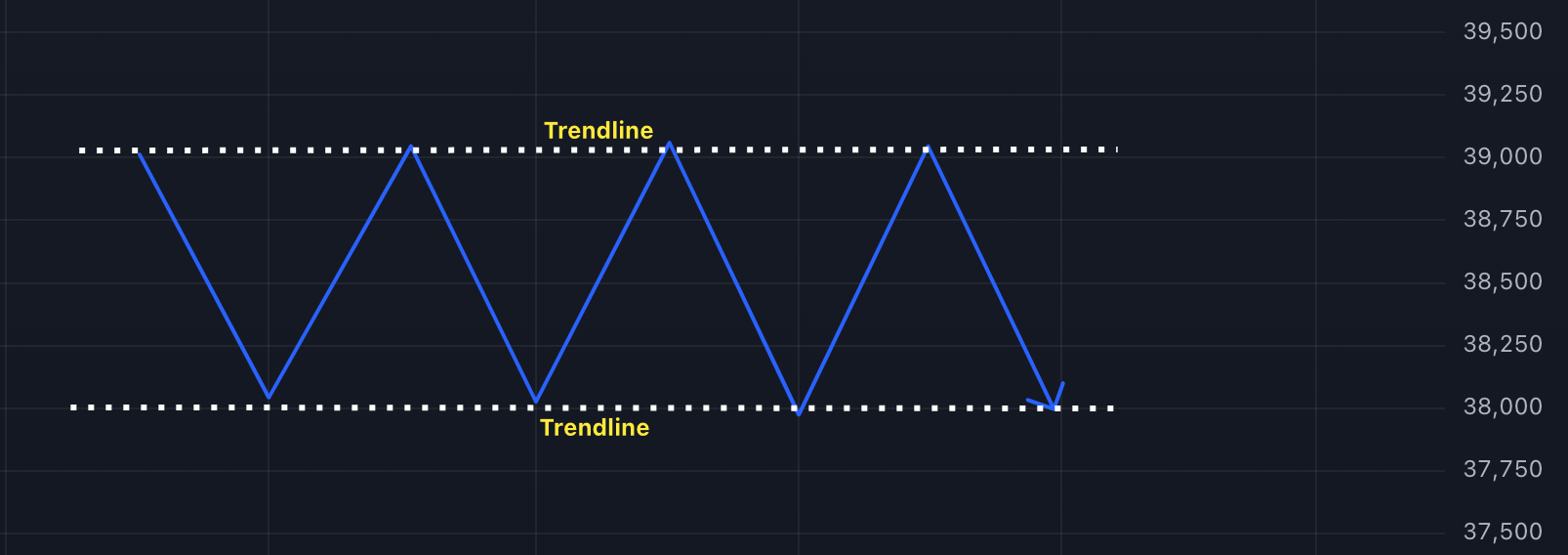
Sideways (Consolidation)
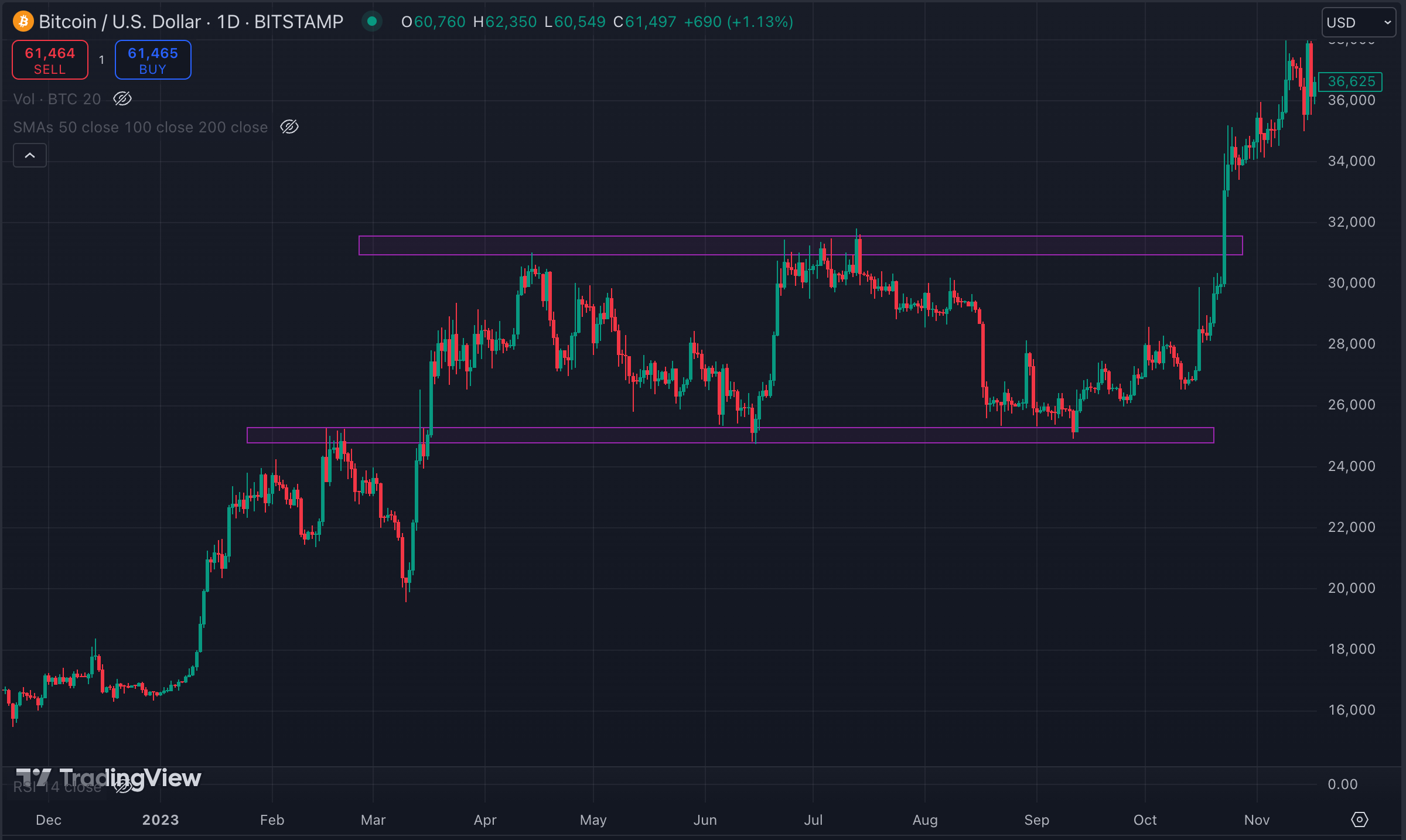
- A sideways trend occurs when the price moves within a narrow range, neither creating higher highs nor lower lows. This indicates a period of consolidation where supply and demand are relatively balanced.

Consolidation - Theory 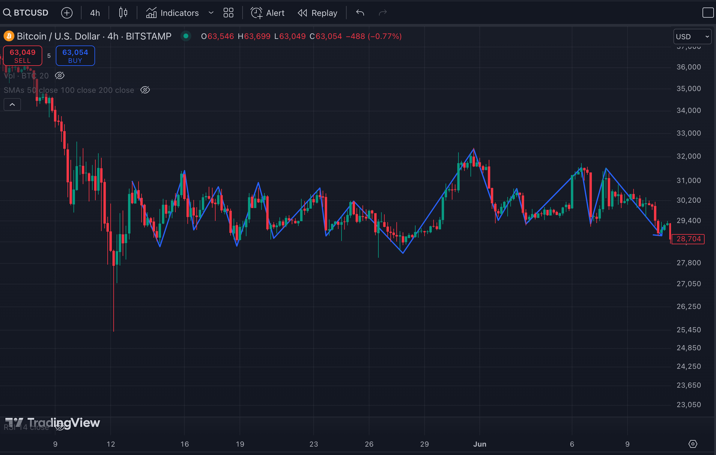
Consolidation Example - Sideways trends can signal uncertainty in the market, and traders often wait for a breakout in either direction before entering new positions. It's also a time when accumulation or distribution might be happening, setting the stage for the next significant price movement.
Trendlines
To help you visually identify a trend, you can draw trendlines on the chart.
Why Identify Trends?
A trend indicates the general direction in which the market is moving, either upward (uptrend), downward (downtrend), or sideways (consolidation). Understanding the direction of a trend can help align your strategies with the market's momentum.
When trends break, it becomes even more interesting. A break in an uptrend, for example, can signal a potential reversal or correction, which may be a good opportunity to sell. On the flip side, a break in a downtrend might suggest a shift toward a bullish market, presenting a buying opportunity.
In trading, there's a saying: "The trend is your friend." This means it's often safer to trade in the direction of the prevailing trend until there's evidence that the trend has changed. By following the trend, traders can minimize risk and increase the likelihood of profitable trades.
Key reasons to identify trends include:
- Recognizing Market Momentum: Trends help you understand whether buyers (uptrend) or sellers (downtrend) are in control of the market.
- Spotting Reversal Points: When a trend breaks, it may indicate a change in direction, helping you identify potential entry or exit points.
- Maximizing Profitability: Trading in line with the trend increases the probability of success compared to going against it.
Relative Strength Index (RSI)
- RSI is a momentum indicator that measures the speed and change of price movements. It oscillates between 0 and 100, with readings above 70 indicating overbought conditions and below 30 indicating oversold conditions.
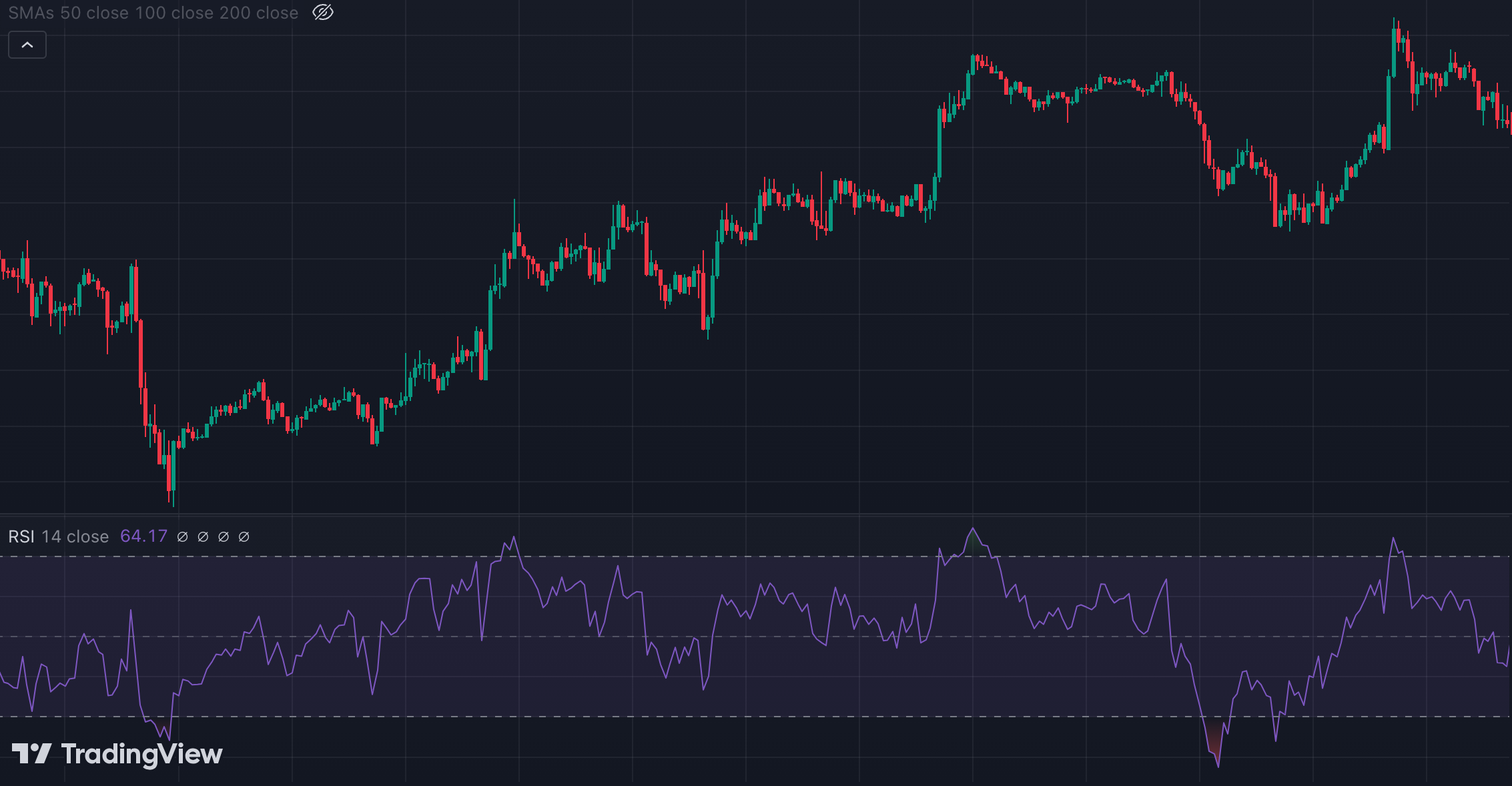
- RSI helps traders identify when an asset may be overbought or oversold, signaling potential reversals.
- RSI calculation
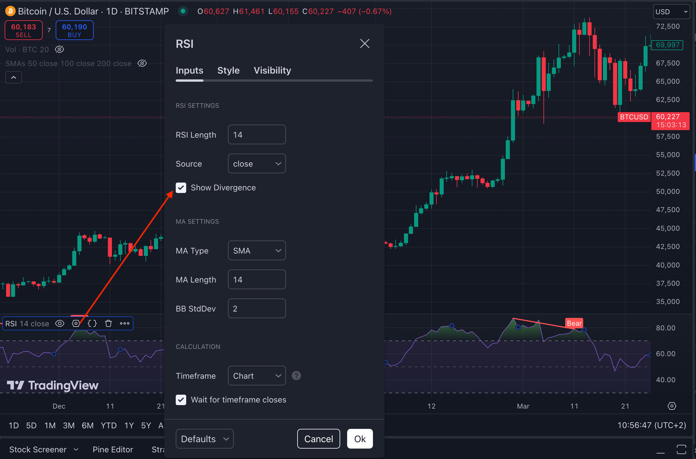
- You can adjust the number of time periods for RSI if needed. The 14-period setting is a popular choice.
RSI Divergence
Another widely used method is to look for a divergence between the RSI and the price movement of the asset, which can indicate a potential reversal. This occurs when the price moves in one direction, while the RSI moves in the opposite direction.
- Bullish Divergence: Price makes lower lows, but the RSI makes higher lows, signaling a potential reversal upward.
- Bearish Divergence: Price makes higher highs, but the RSI makes lower highs, indicating a potential downward reversal.
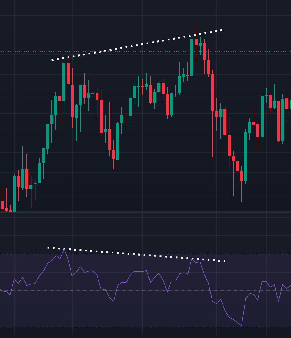
TradingView can automatically spot divergences. However, be cautious—TradingView will show you all technically calculated divergences, which may include weak patterns. You can review past divergence signals to assess their accuracy, but you might find many close calls. It's often preferable to wait for a strong divergence before making a move.
Moving Average (MA)
- A moving average smooths out price data by calculating the average price over a specific number of periods. For example, a 21-day Simple Moving Average (SMA) adds up the closing prices of the last 21 days and divides the total by 21.
- Common Types:
Simple Moving Average (SMA): The average over a set number of days.
Exponential Moving Average (EMA): Puts more weight on recent price data, making it more responsive to new information.
- Moving averages help identify trends by smoothing out price fluctuations.
- MAs are lagging / trend-following indicators. While buy or sell signals may occur late, they allow you to profit from the major trend. Early opportunities might be missed, but MAs reduce risk by keeping you on the “right side” of the market.
- MA as Support/Resistance
Moving averages can act as dynamic support or resistance levels. For instance, in an uptrend, the price often bounces off the MA, using it as support, and in a downtrend, it may act as resistance.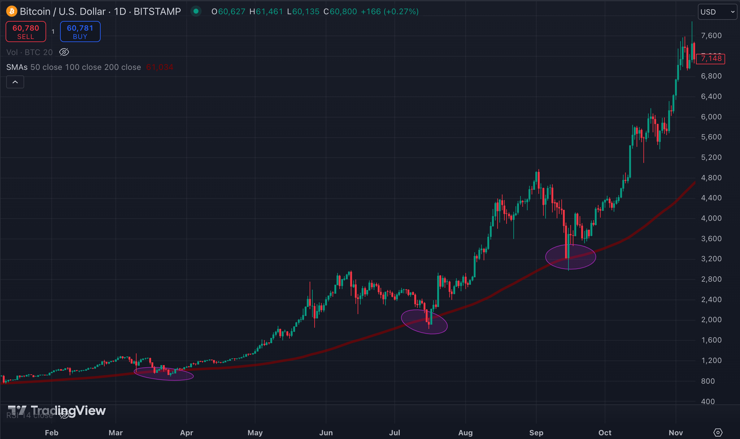
100 day SMA - Support 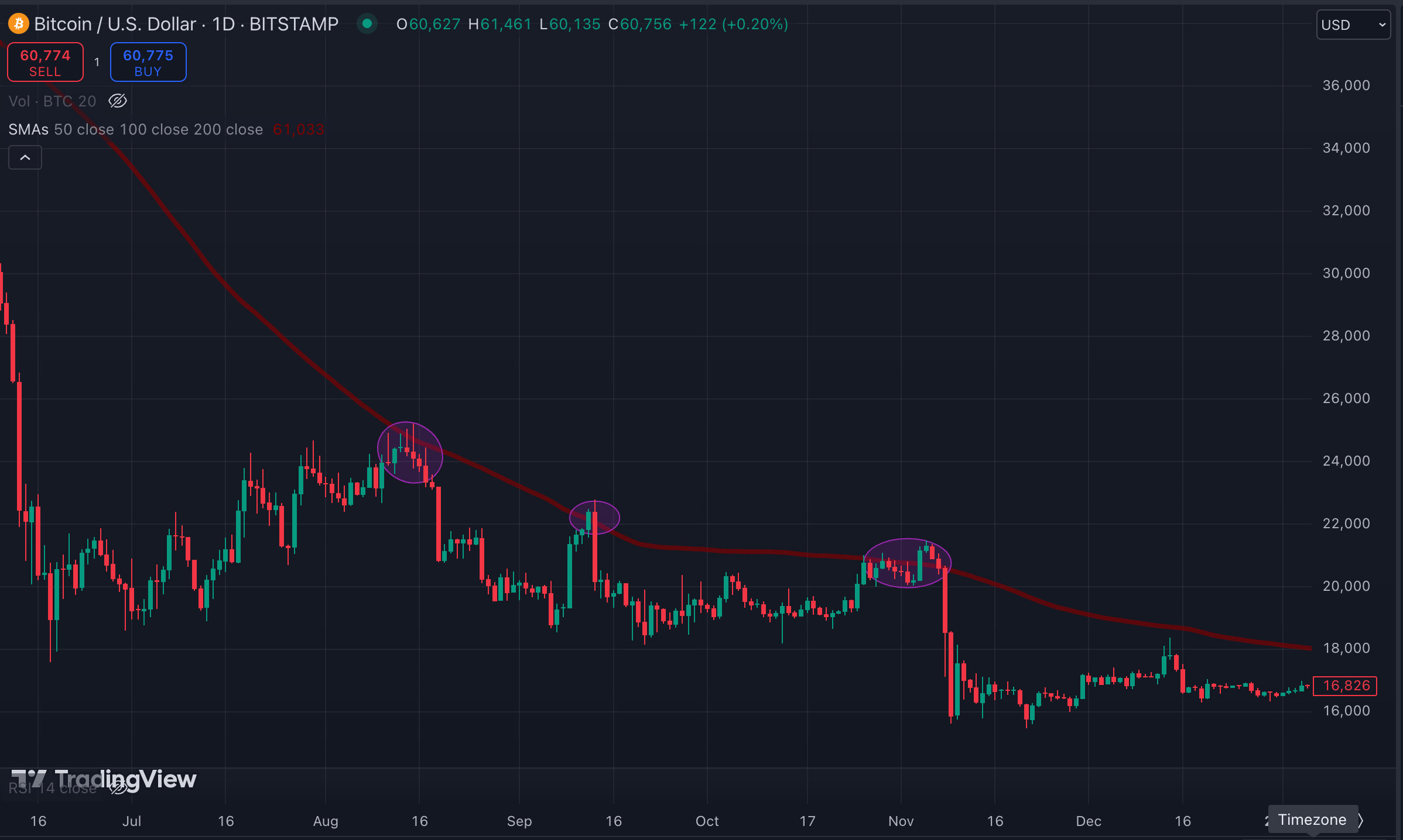
100 day SMA - Resistance - Breaks Above/Below MAs
A break above or below an MA can indicate a potential shift in price direction.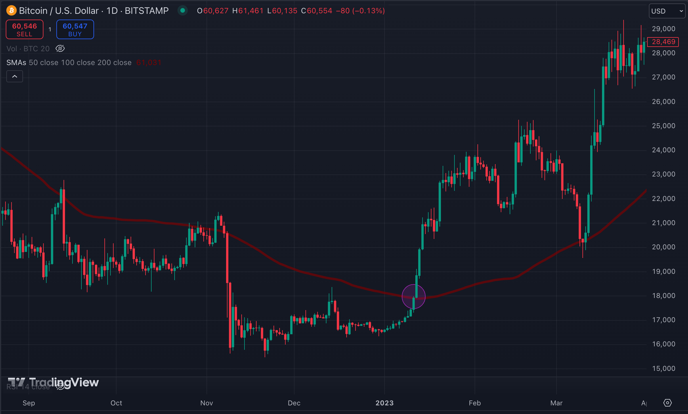
100 day SMA - Breakout 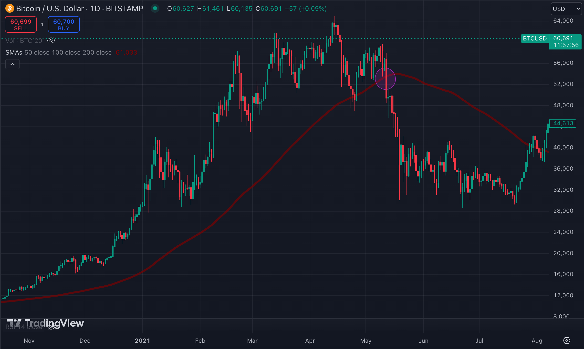
100 day SMA - Breakdown - In a sideways trend, MAs might not be as reliable because they can be crossed multiple times, not providing any clear support or resistance.
- Test different settings like 21, 50, 100 or 200 day MAs. My personal setting has a 50, 100 and 200 SMA.
Volume
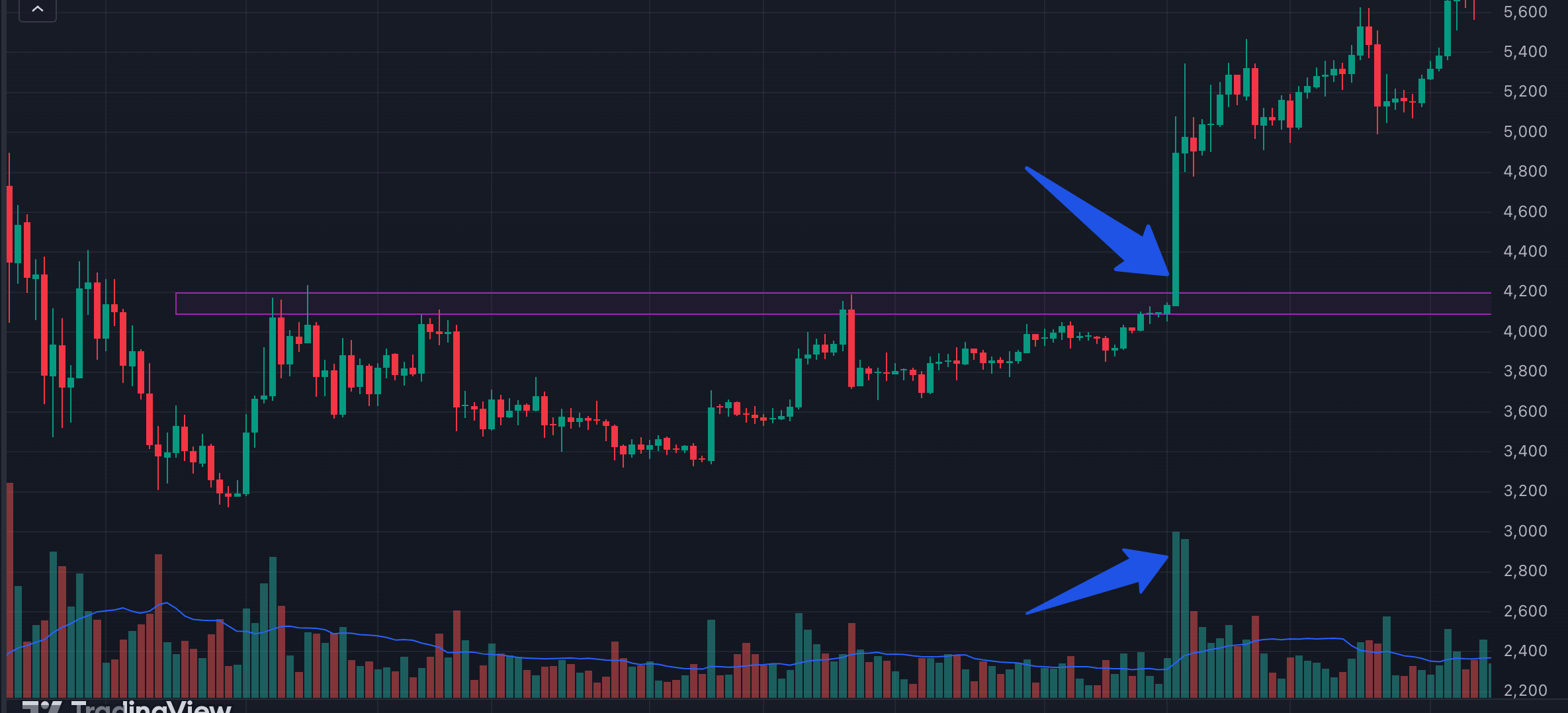
- Volume represents the number of coins or tokens traded during a specific period.
- High volume often confirms the strength of a price movement, while low volume may signal a lack of conviction in the trend.
Support and Resistance
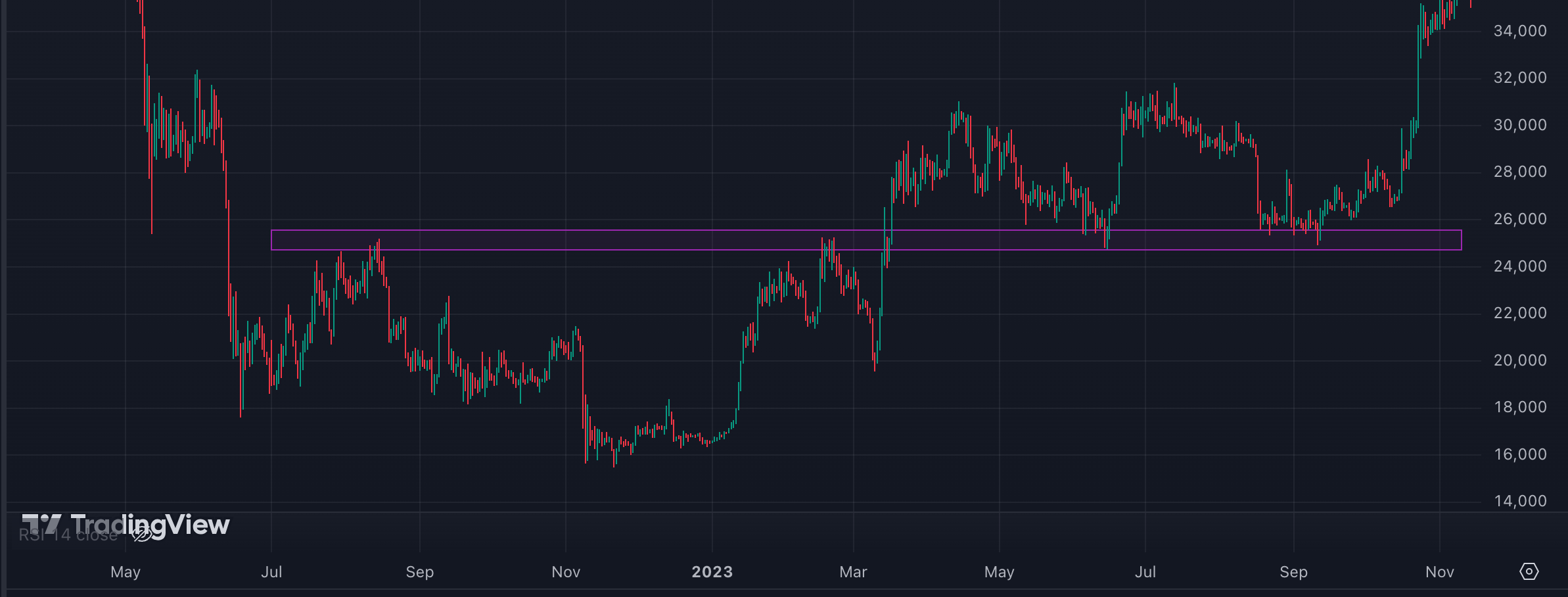
- Support: A price level where an asset tends to stop falling because demand increases.
- Resistance: A price level where an asset tends to stop rising due to increased selling pressure.
- Identifying these levels helps determine potential entry and exit points. Especially interesting are breaks of support or resistance.
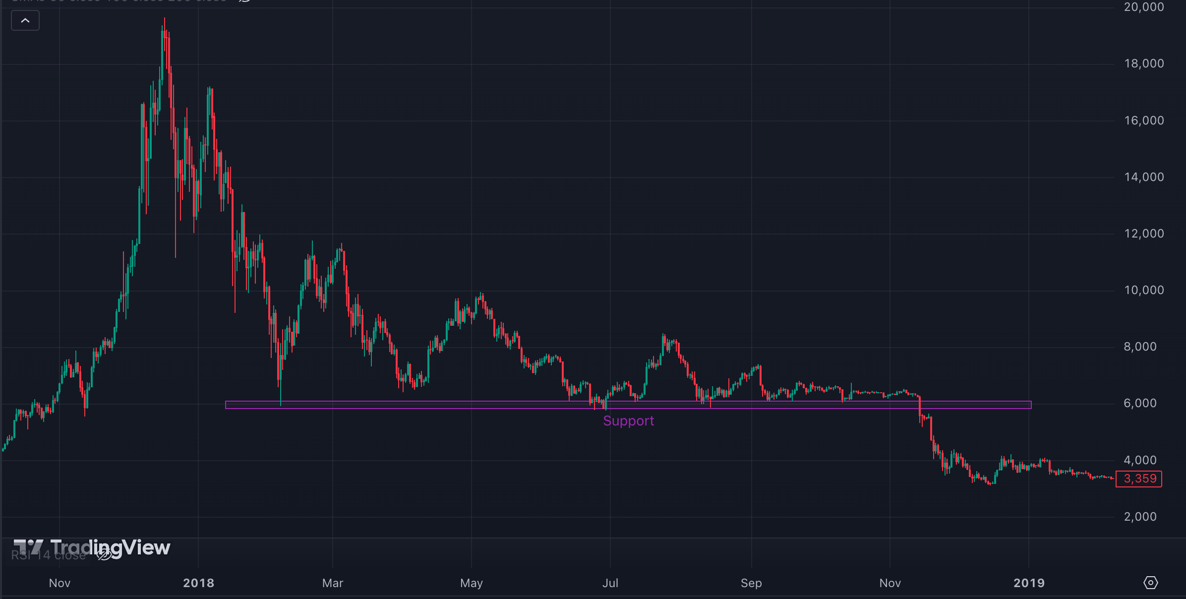
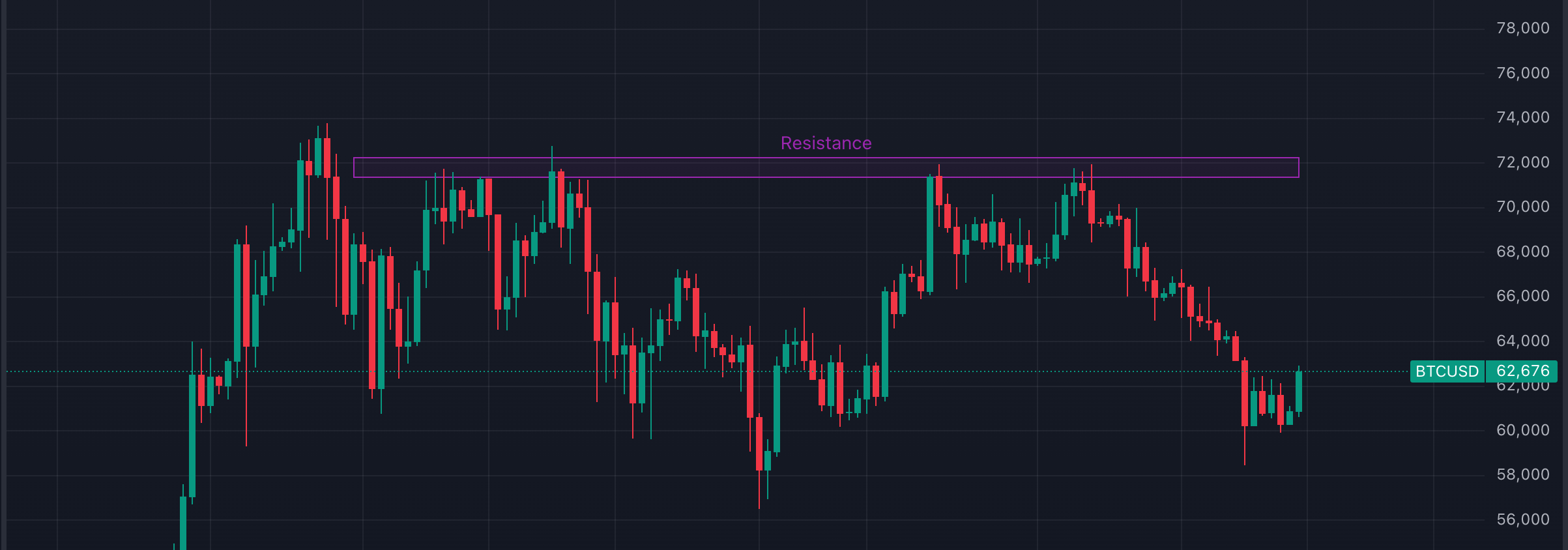
- Former resistance can turn into support, and support can turn into resistance.
Fibonacci Extensions
Fibonacci extensions are a tool traders use to project possible price targets after a significant price movement. These projections are based on mathematical ratios, such as 1.618 and 2.618, which are derived from the Fibonacci sequence. Extensions are especially useful for identifying key areas where price might reverse or extend further after a retracement.
How to Use Fibonacci Extensions
- To draw Fibonacci extensions in an uptrend, start by identifying a significant low (the starting point) and then drag to a significant high (the top of the move). Next, extend it down to the retracement level (the low of the pullback).
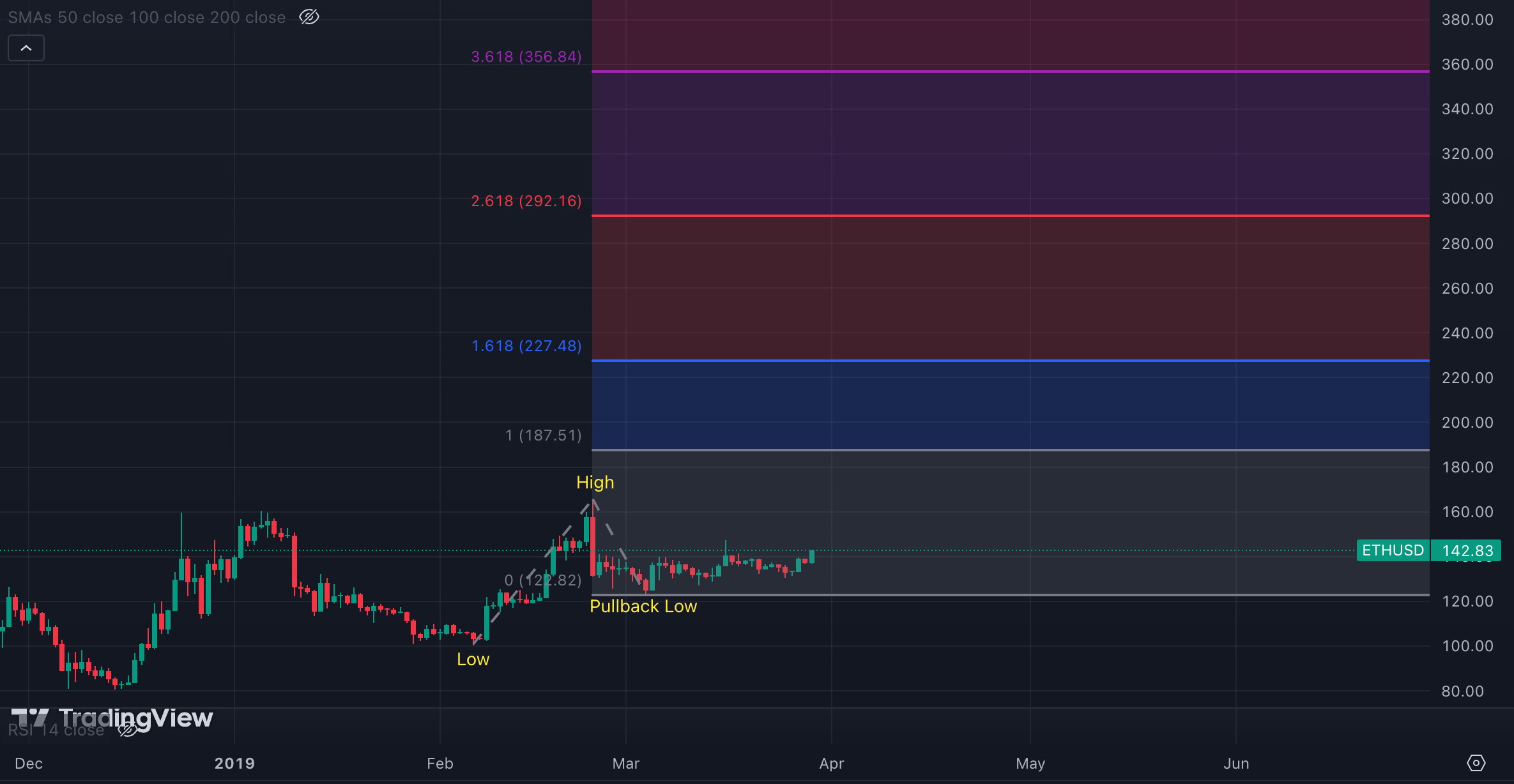
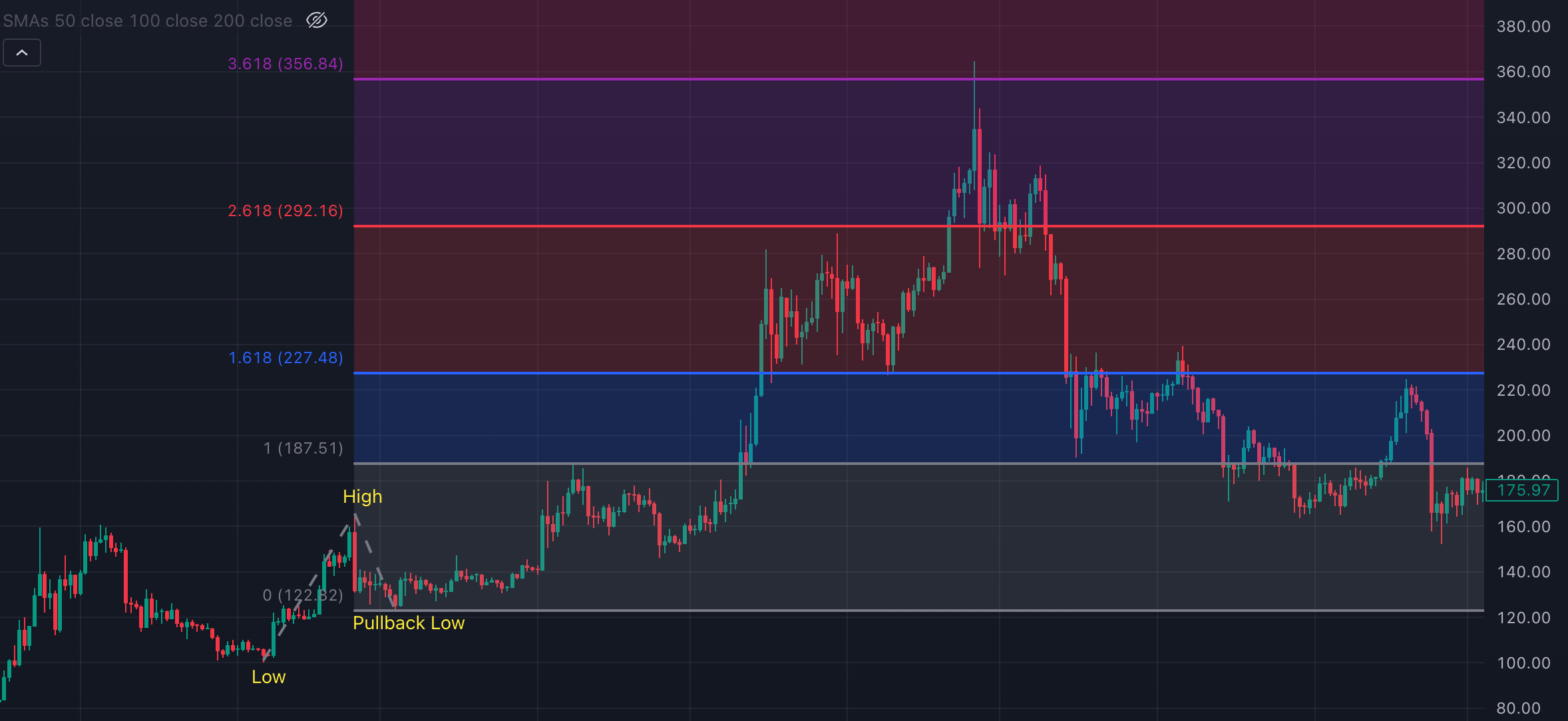
The extension levels above project potential future resistance points where the price could either reach or reverse. As time progresses, we can see that the price reached the 3.618 extension before the trend changed:
Why Use Fibonacci Extensions?
- They help traders identify potential future support and resistance levels.
- They provide a way to project price targets after a retracement.
- Fibonacci levels are often seen as significant turning points in the market, where price reversals or extensions may occur.
Fibonacci Retracement
- Fibonacci retracement levels are used to identify potential reversal points where the market might pause, pull back, or reverse during a trend. These levels are based on key Fibonacci ratios: 23.6%, 38.2%, 50%, 61.8%, and 78.6%, which are derived from the Fibonacci sequence. Traders use these retracement levels to gauge where to enter or exit a trade based on historical price action.
- How to Use Fibonacci Retracement
There are two main scenarios where you can apply Fibonacci retracement:
In an Uptrend:
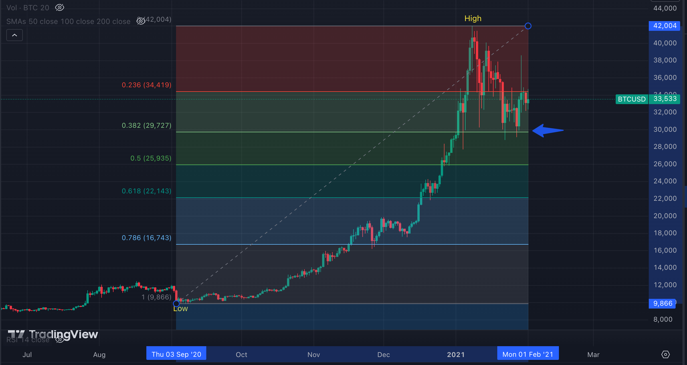
To draw Fibonacci retracement levels in an uptrend, select the low of a significant price movement (swing low) and drag up to the high (swing high). This will show the retracement levels between the two points. If the price pulls back from the high, Fibonacci levels (such as 38.2% or 61.8%) can act as potential support levels, where the price might reverse and continue upward.
In a Downtrend:
In a downtrend, start by selecting the high of the price movement (swing high) and drag down to the low (swing low). The retracement levels will show potential resistance areas if the price retraces upward before continuing its downward trend.
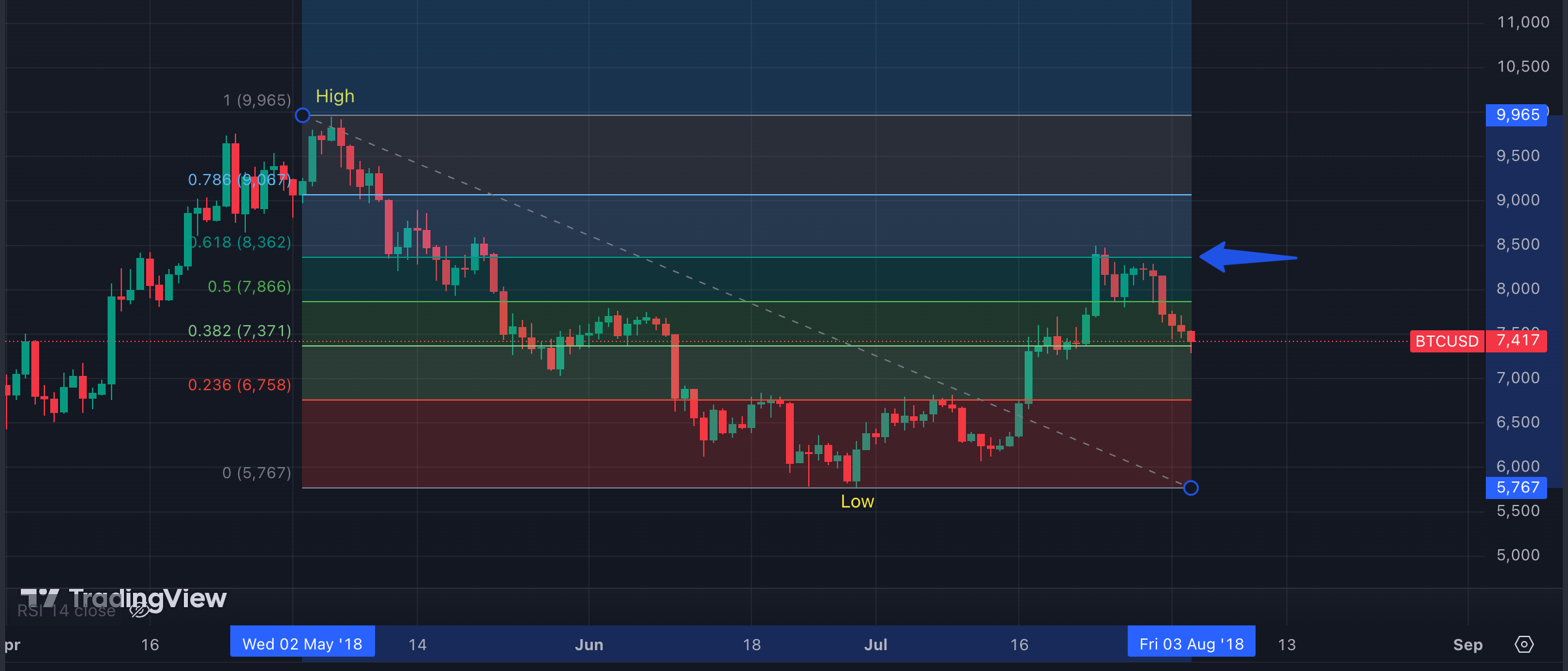
Why Use Fibonacci Retracement?
- Key Reversal Points: Fibonacci retracement helps traders identify areas where the price might reverse, allowing for strategic entry and exit points.
- Support and Resistance: These levels can align with key areas of support or resistance in the market.
No Trading Zones
- No trading zones are price ranges where traders avoid placing trades due to uncertainty or low confidence in the direction of the trend.
For example, during consolidation, it may be wiser to wait for a confirmed break of support or resistance before taking action. Entering a trade at $20 during consolidation can be risky if there isn't much conviction about where prices are headed.
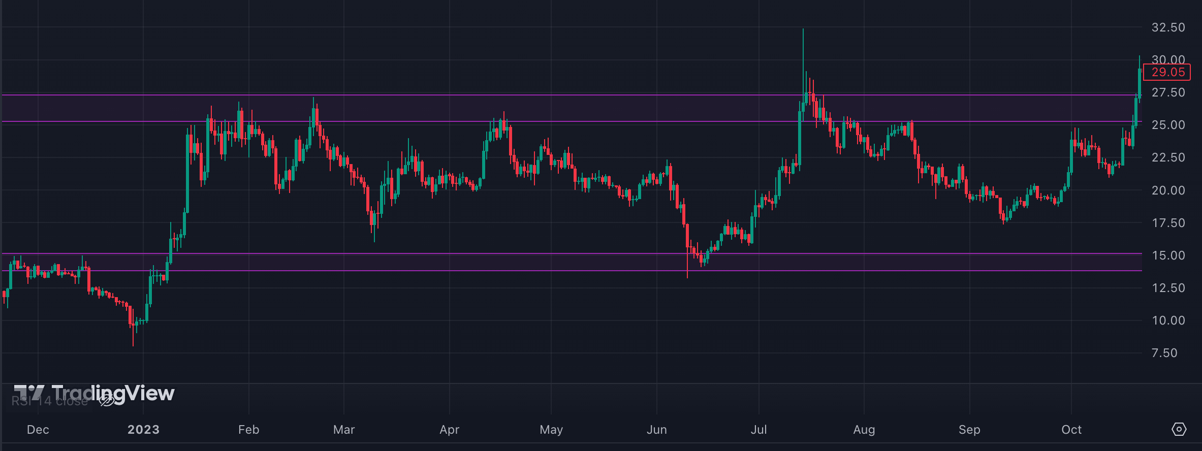
No Trading Zone - No trading zones don't necessarily have to be between support and resistance levels; they can also exist between two moving averages (MAs) or Fibonacci retracement levels. This occurs when the price moves within these levels but shows no clear indication of a breakout.
- Recognizing no trading zones helps traders avoid risky areas where price movement is uncertain, preventing hasty trades and limiting exposure to unpredictable market conditions.
Confluence
- Confluence refers to the alignment of multiple technical indicators or patterns pointing to the same conclusion.
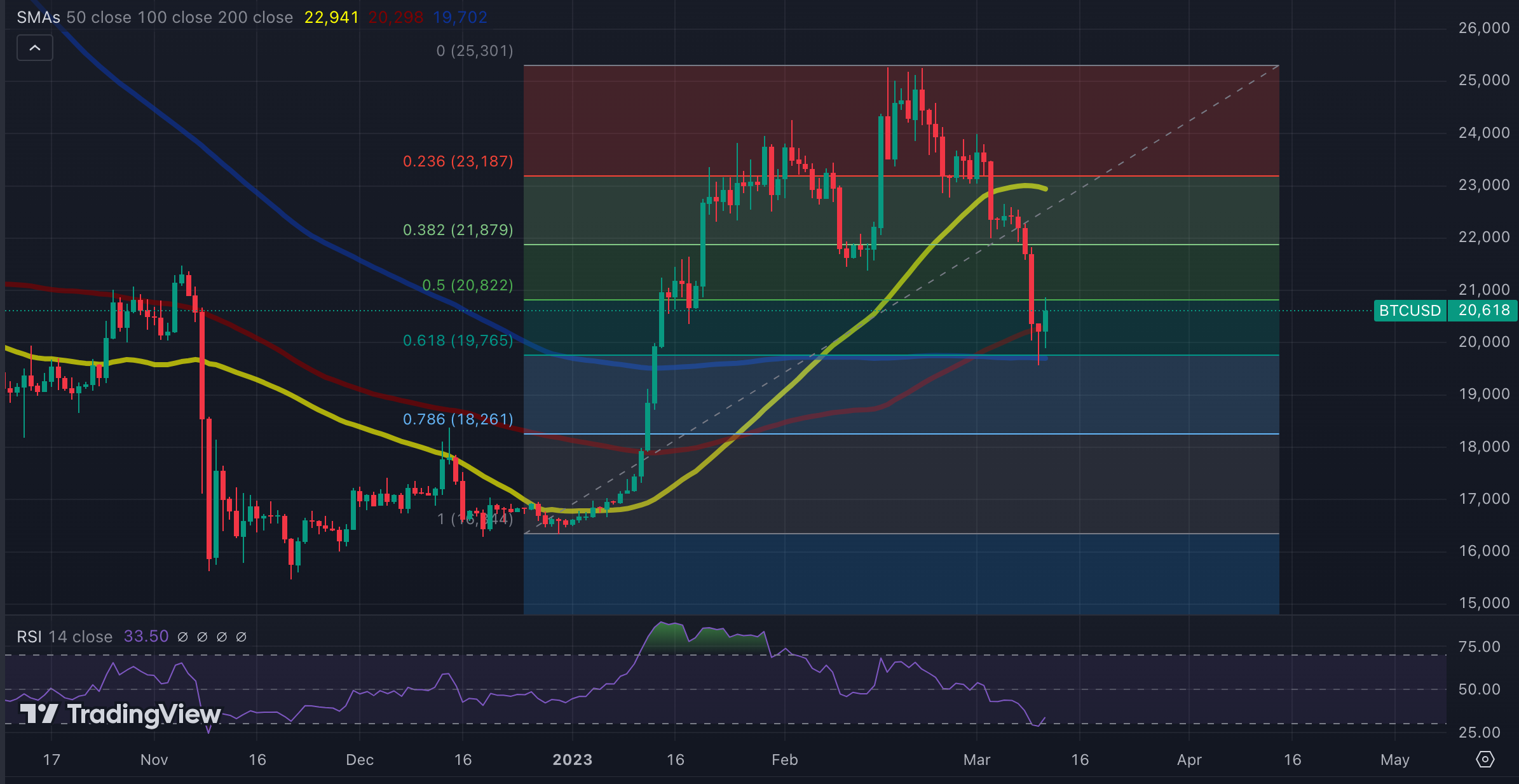
100 & 200 SMA support - 0.618 fib retracement level - RSI touching oversold level - When several indicators confirm the same market direction, it strengthens the trade signal, providing higher confidence.
Chart Patterns
Chart patterns are visual formations on a price chart that signal potential future price movements. They are often used by traders to anticipate whether a trend will continue or reverse.
Common Chart Patterns:
- Head and Shoulders: This pattern often indicates a reversal of an uptrend, with a peak (head) between two smaller peaks (shoulders). A break below the "neckline" signals a potential downtrend.
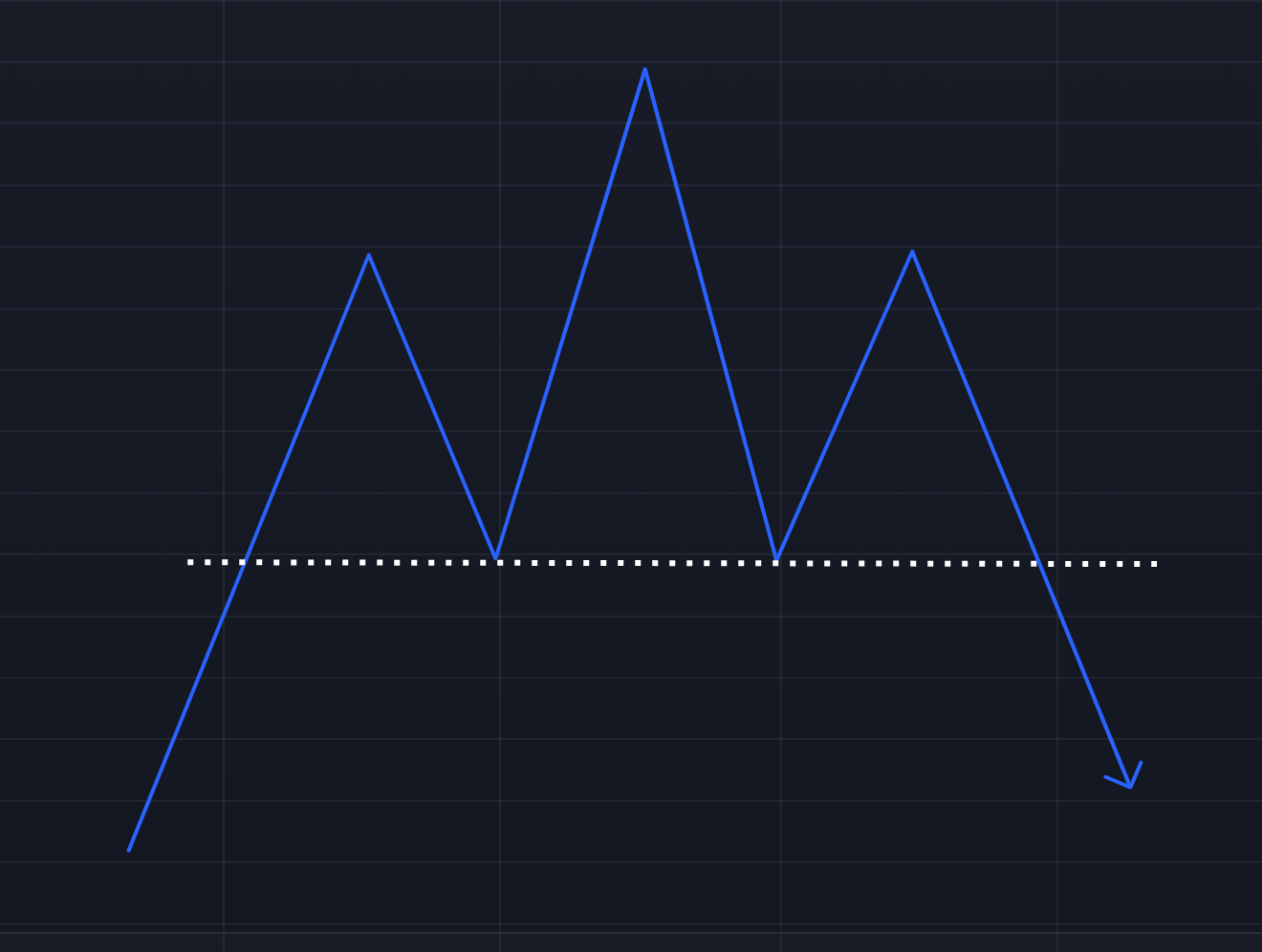
Head and Shoulders Pattern - Double Top/Bottom: A double top signals a reversal from an uptrend to a downtrend, while a double bottom signals a reversal from a downtrend to an uptrend. These patterns are characterized by two peaks at similar price levels.
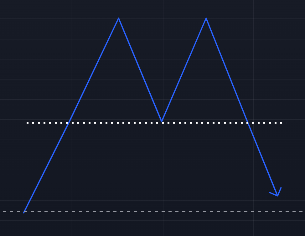
Double Top Pattern 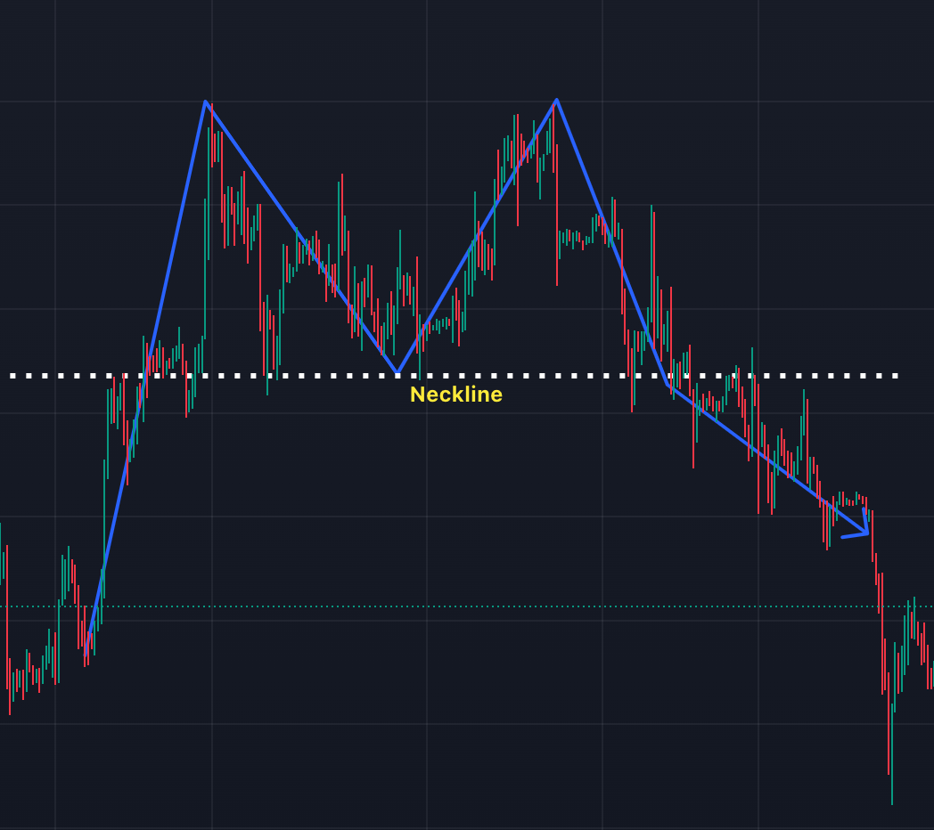
Double Top 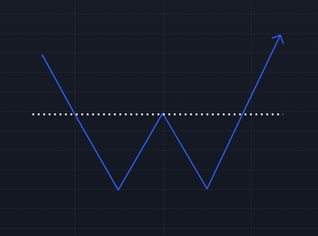
Double Bottom Pattern - Triangles: Triangular patterns signal potential continuation or reversal, depending on the type:
Ascending Triangle: This bullish pattern forms with a horizontal resistance line and an upward-sloping support line, suggesting the price may break higher.
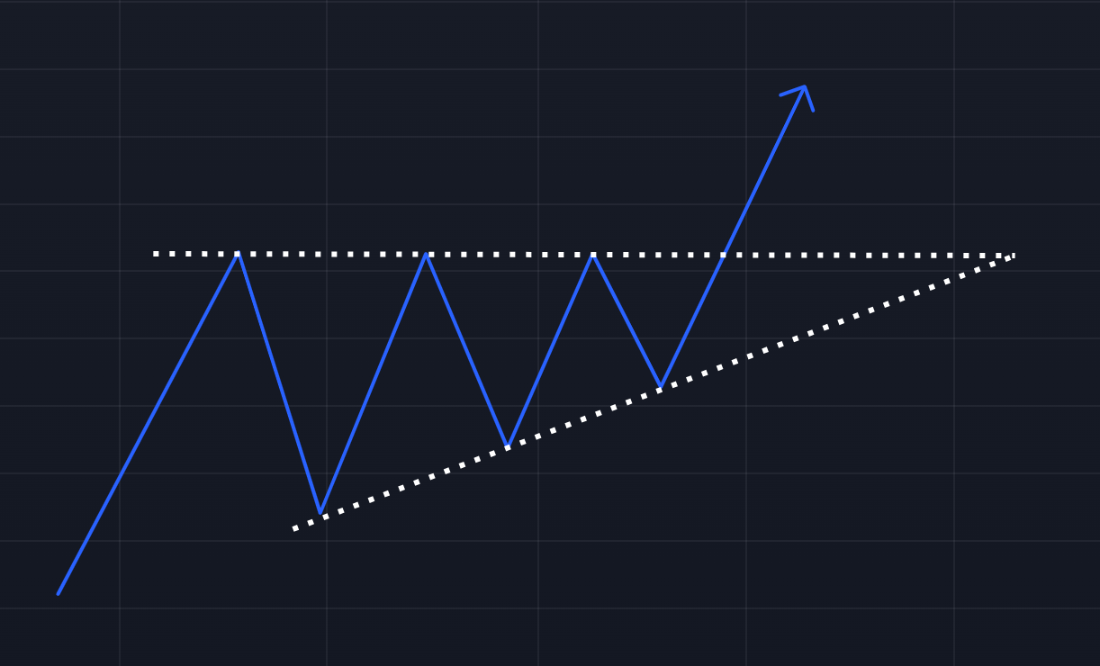
Ascending Triangle Descending Triangle: A bearish pattern with a horizontal support line and a downward-sloping resistance line, indicating the price may break lower.
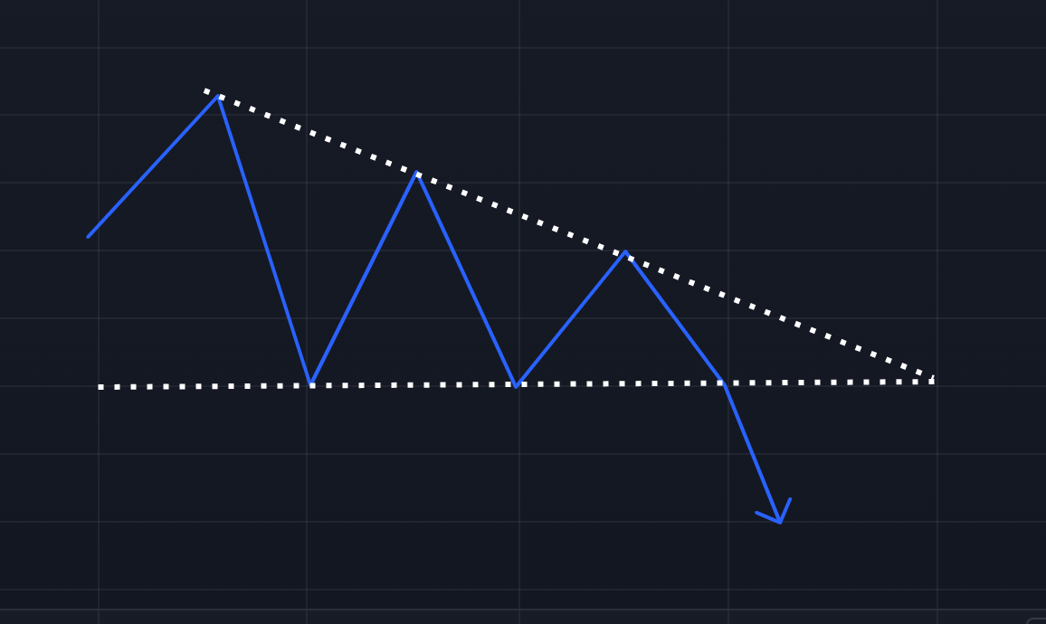
Descending Triangle Symmetrical Triangle: Formed by two converging trendlines, this pattern indicates a breakout in either direction, depending on market conditions.
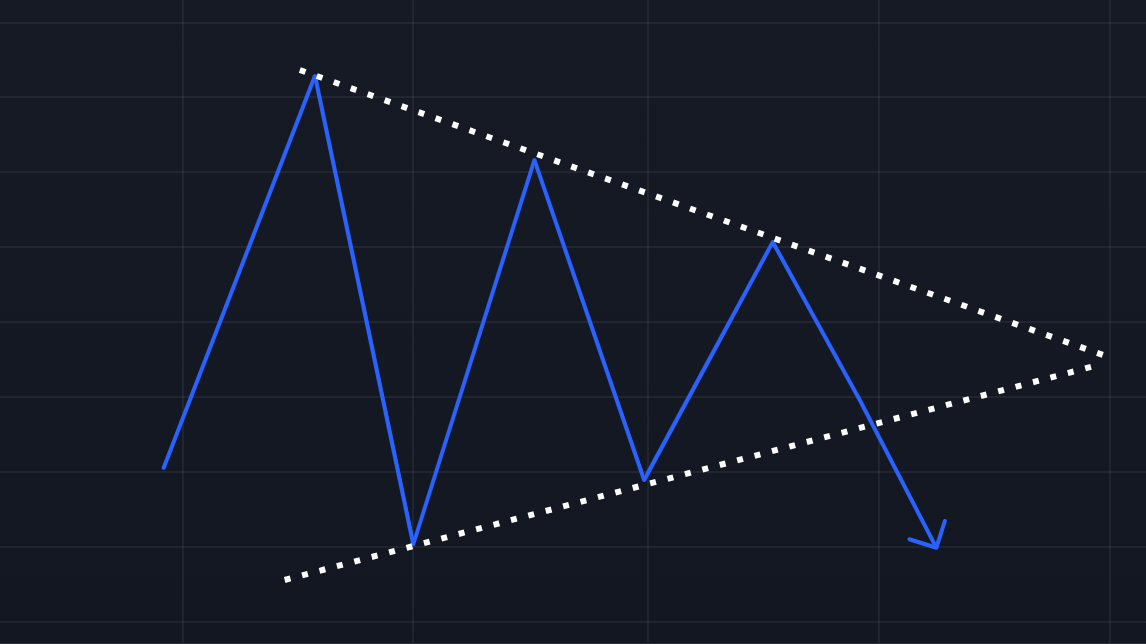
Symmetrical Triangle - Flags: Flags are small consolidations after a sharp price movement, usually followed by a continuation in the direction of the original trend. They form between parallel trendlines and can be bullish or bearish, depending on the prior movement.
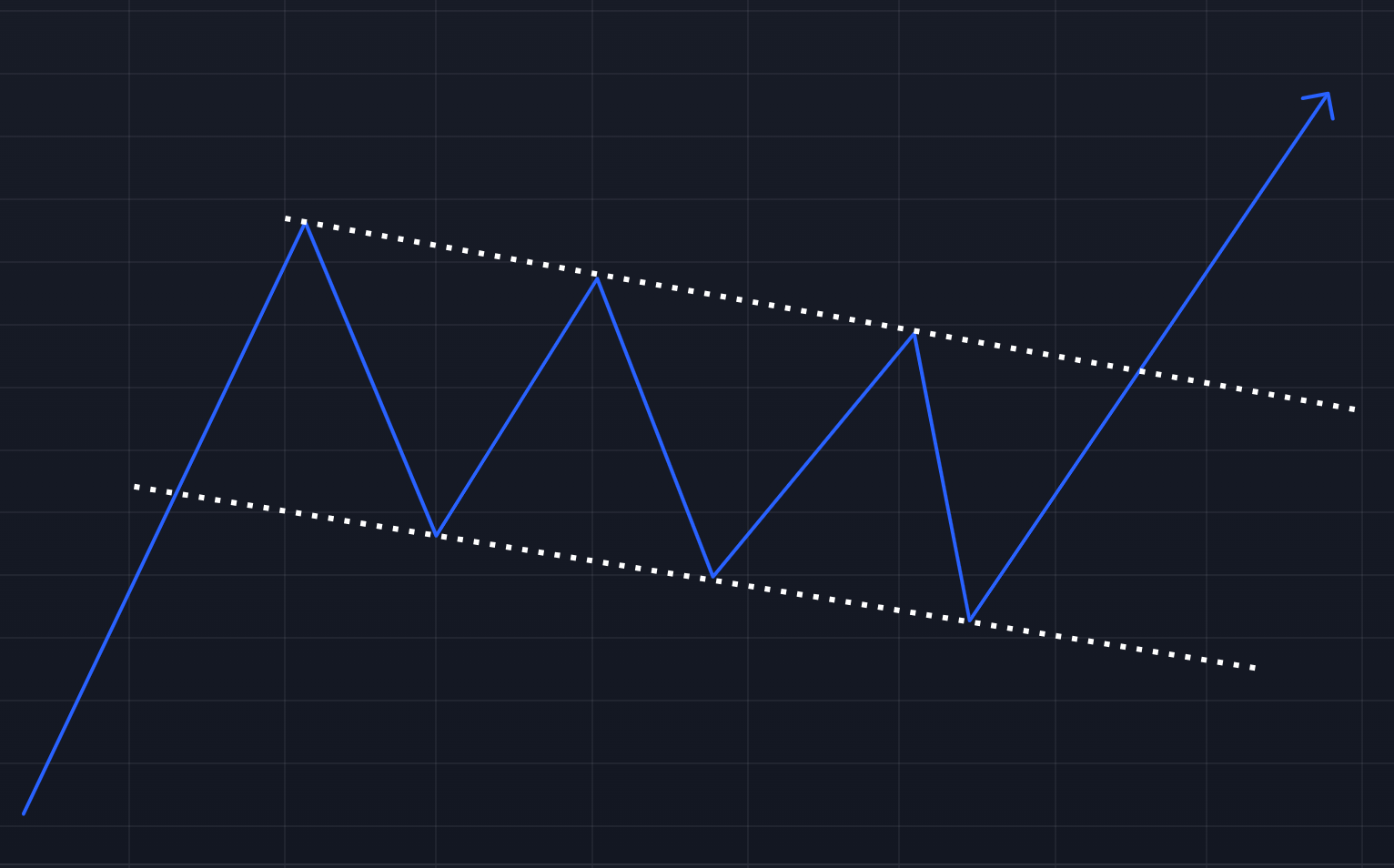
Flag Pattern
Recognizing these chart patterns helps in predicting future price movements and strategically planning entry and exit points. While chart patterns provide valuable insights, they should be combined with other tools, such as volume analysis or technical indicators, to confirm signals.
There are many more chart patterns—too many to cover in depth here. In fact, I've got a 700-page book on chart patterns, but diving that deep isn't necessary for most traders. Focus on the basics.
Candlestick Patterns
- Candlestick patterns form based on the arrangement of one or more candlesticks and provide insight into future price action. Common patterns include:
Doji: A candlestick with a small or non-existent body, signaling indecision between buyers and sellers. The market may be poised for a reversal or continuation, depending on the surrounding candles.
Tweezer Tops/Bottoms: These patterns form when two or more candlesticks have nearly identical highs (tweezer top) or lows (tweezer bottom). They often indicate a potential reversal of the current trend.
- Candlestick patterns can be a deep and complex topic, with numerous patterns providing various signals. While it's a powerful tool for some traders, I personally don't focus on candlestick patterns in my analysis.
Practice, Practice, Practice
I know it's the word no one wants to hear, but practice is essential in becoming proficient at technical analysis. In the beginning, I suggest looking at charts and price action daily. Pick one indicator, such as RSI or moving averages, and focus on understanding how it helps identify key price areas or trends.
You can also start trading with a demo account on platforms like TradingView. This way, you can practice trading without risking real money. However, don't stick to paper trading for too long. Trading with real money is a completely different experience because emotions and psychology play a significant role when your own funds are on the line.
You could also learn by reviewing other people's technical analysis. For example, Cointelegraph releases weekly price analyses. Try to understand how they arrive at their price targets and what indicators they use. But remember—don't follow them blindly. These analyses are not tailored to your specific situation, such as your time horizon or risk tolerance! I personally stopped reading the Cointelegraph price analyses as they often don't align with my time horizon.
Always keep in mind that past performance doesn't guarantee future results. Markets evolve, and what worked in the past might not work in the future.
It's important not to clutter your charts with too many indicators, thinking that more is better. Often, simplicity is key. There are hundreds of indicators available, but you need to find the ones that work best for you.
Most importantly, you need to develop your own trading style and strategy. What works for others might not suit your risk tolerance or goals.